
PODCAST RELOAD
Logo Design and Identity
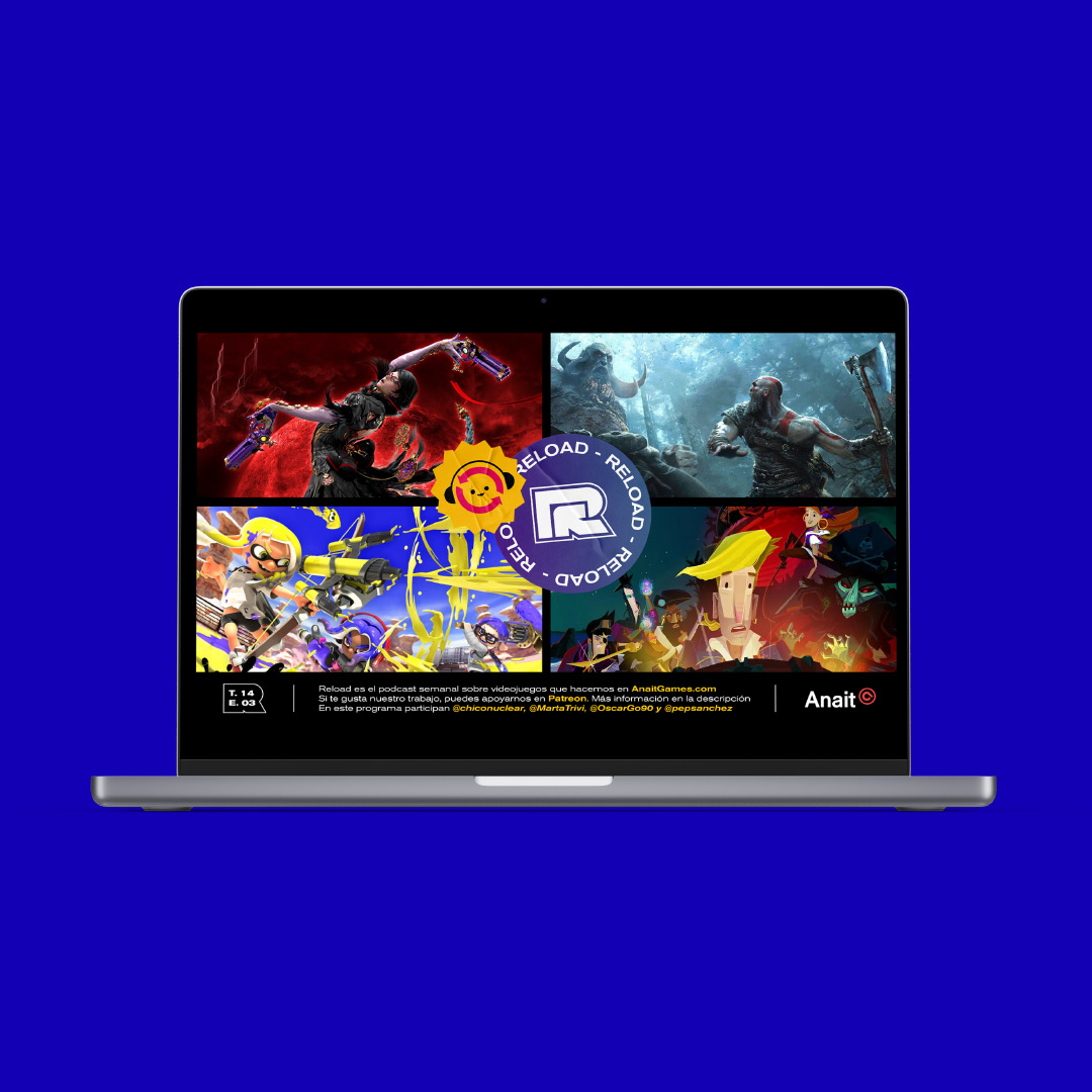
Reload by AnaitGames is one of the oldest and most listened videogame podcasts in Spanish. Every week they analyze the latest releases and debate the hottest topics, mixing rigor and irreverence.
Project details + Process
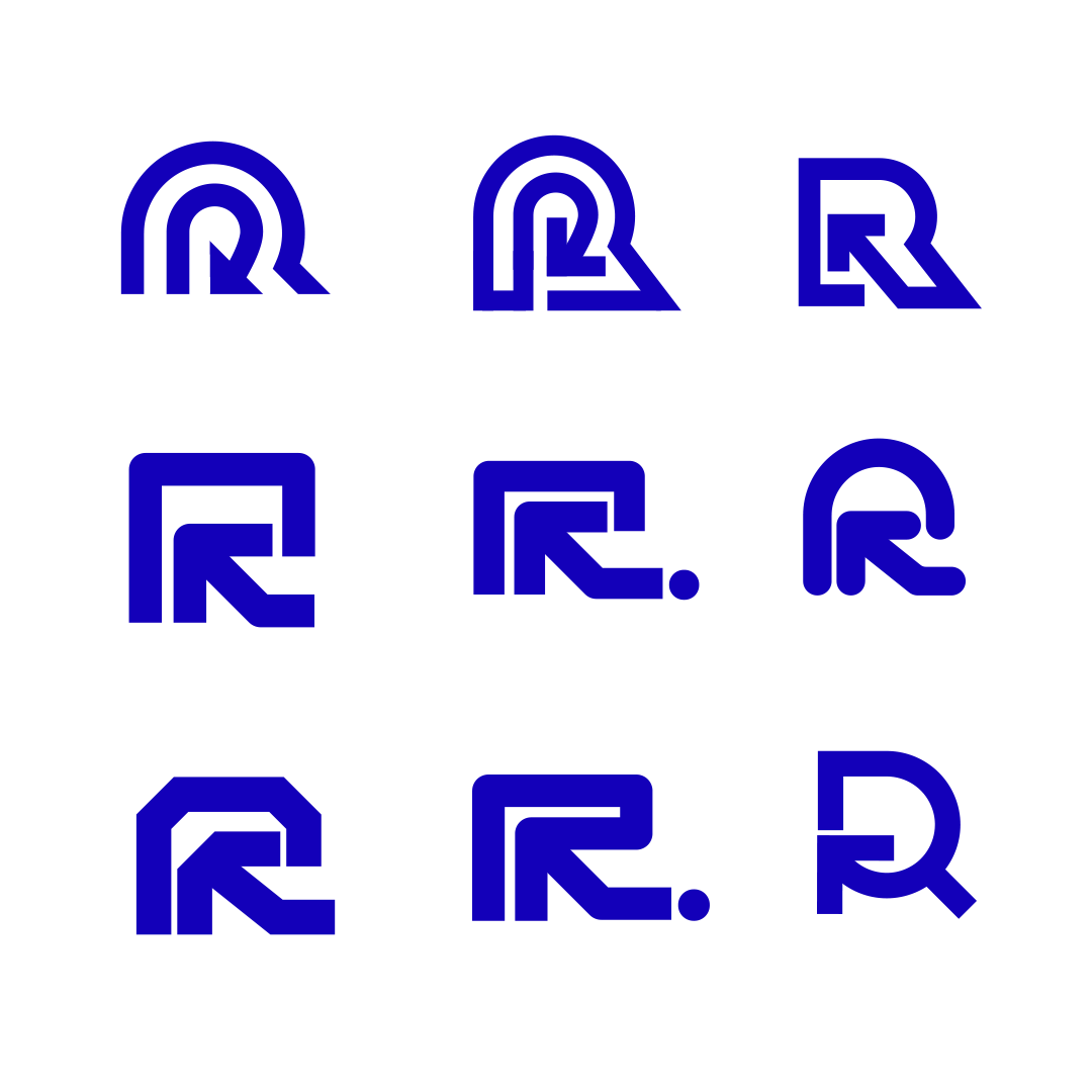
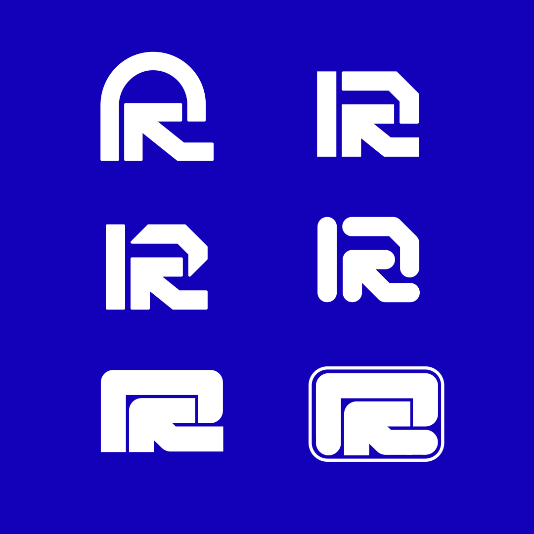
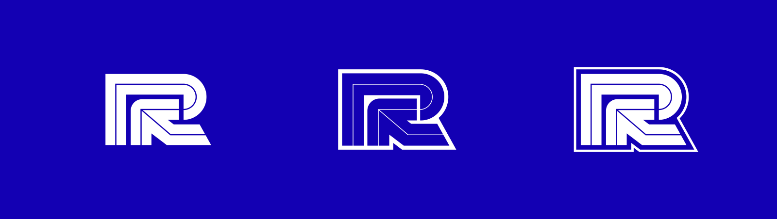
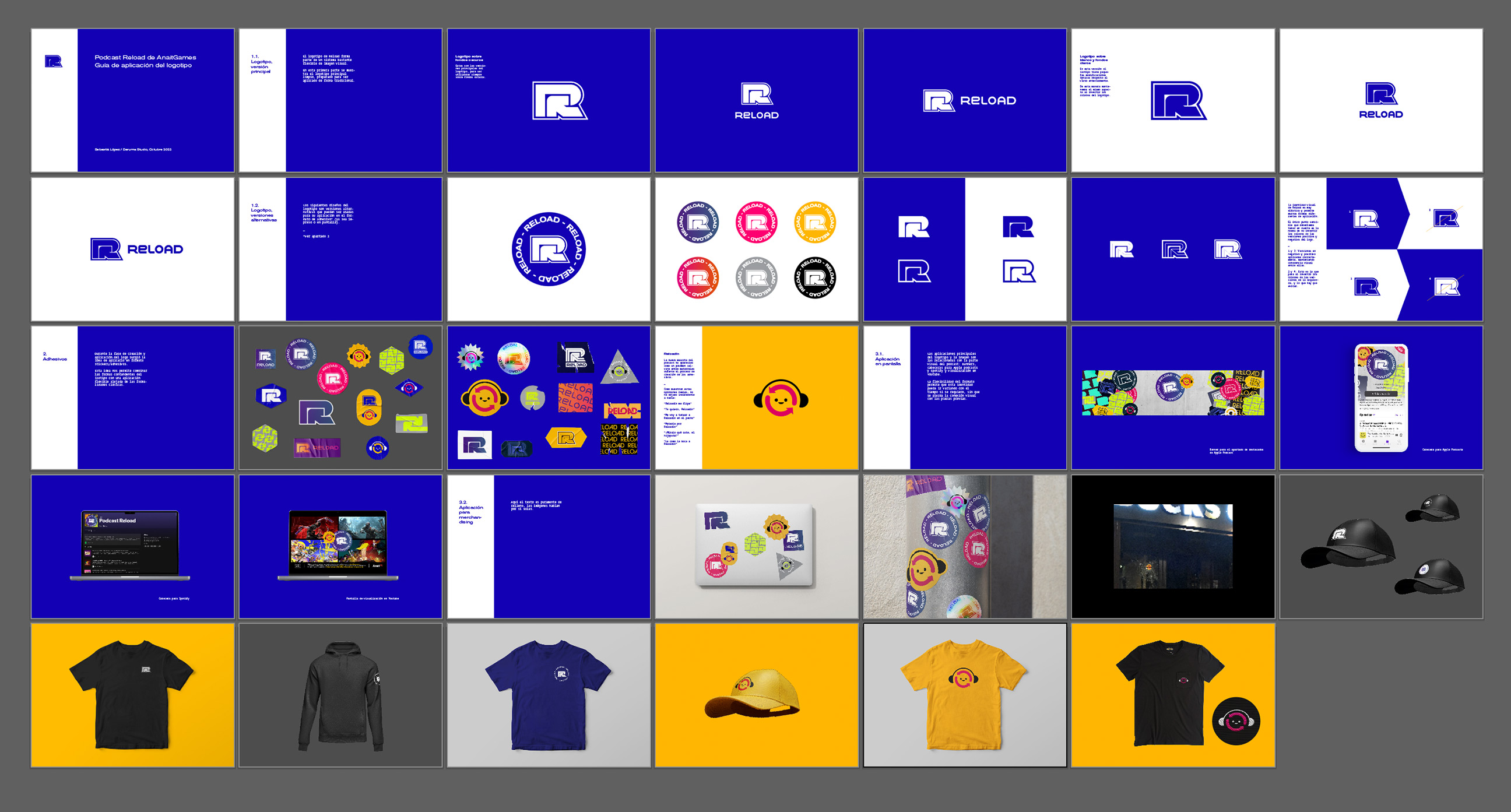
Redesigning an identity for a podcast like Reload has been a delightful work. In the first talks with Víctor and Pep from AnaitGames we found common graphic interests like the style of The Designers Republic or the visuals in Splatoon series. They also needed a personal symbol to make the applications recognisable. So we started testing different kinds of logos mixing the letter R with the arrow from the "loading" symbol.
The tone of the podcast is informal and enjoyable, but at the same time is made by people with a lot of experience in the field. So there was this idea of using that concept in the identity: A stong, heavy and classic isotype but applied in an informal and elastic way.
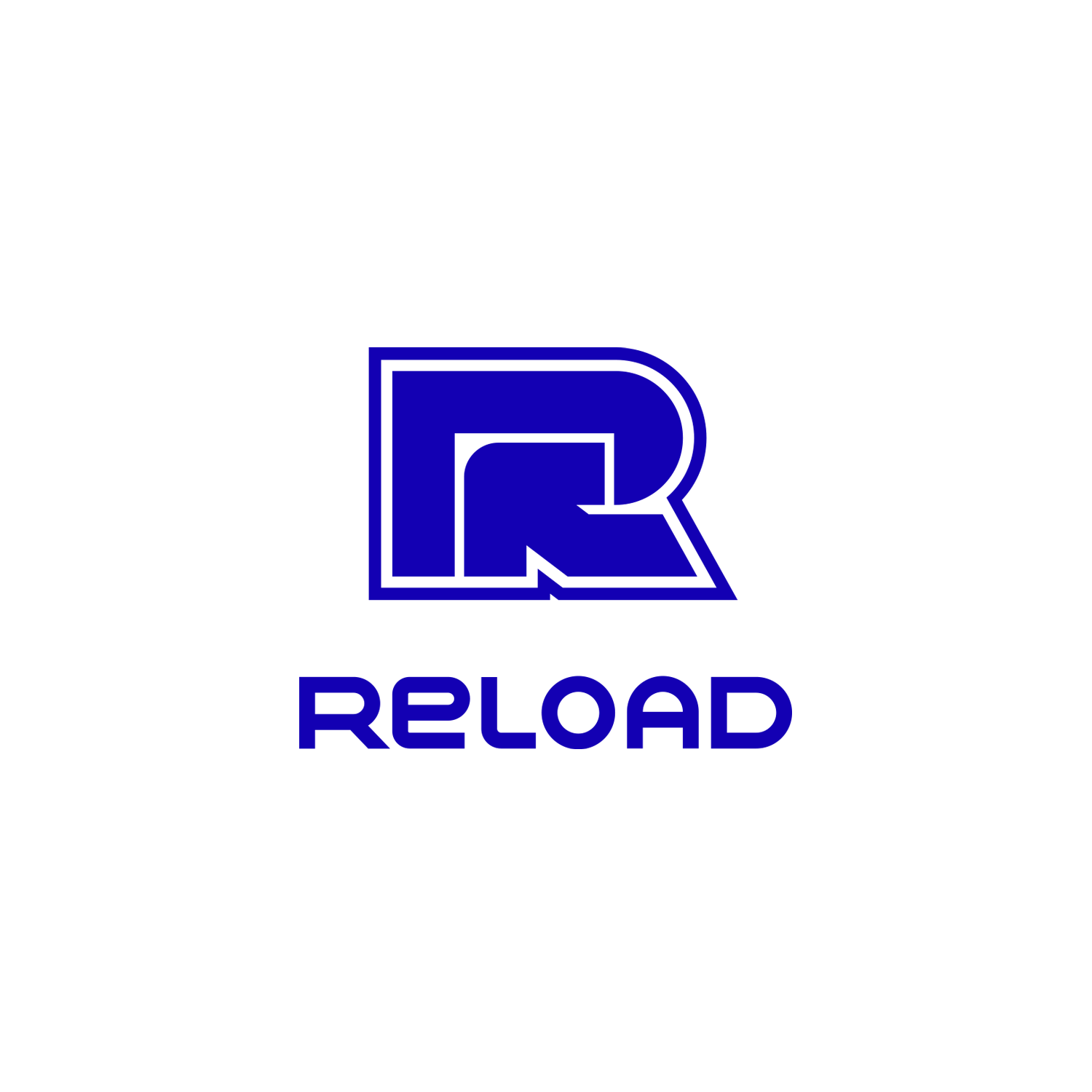
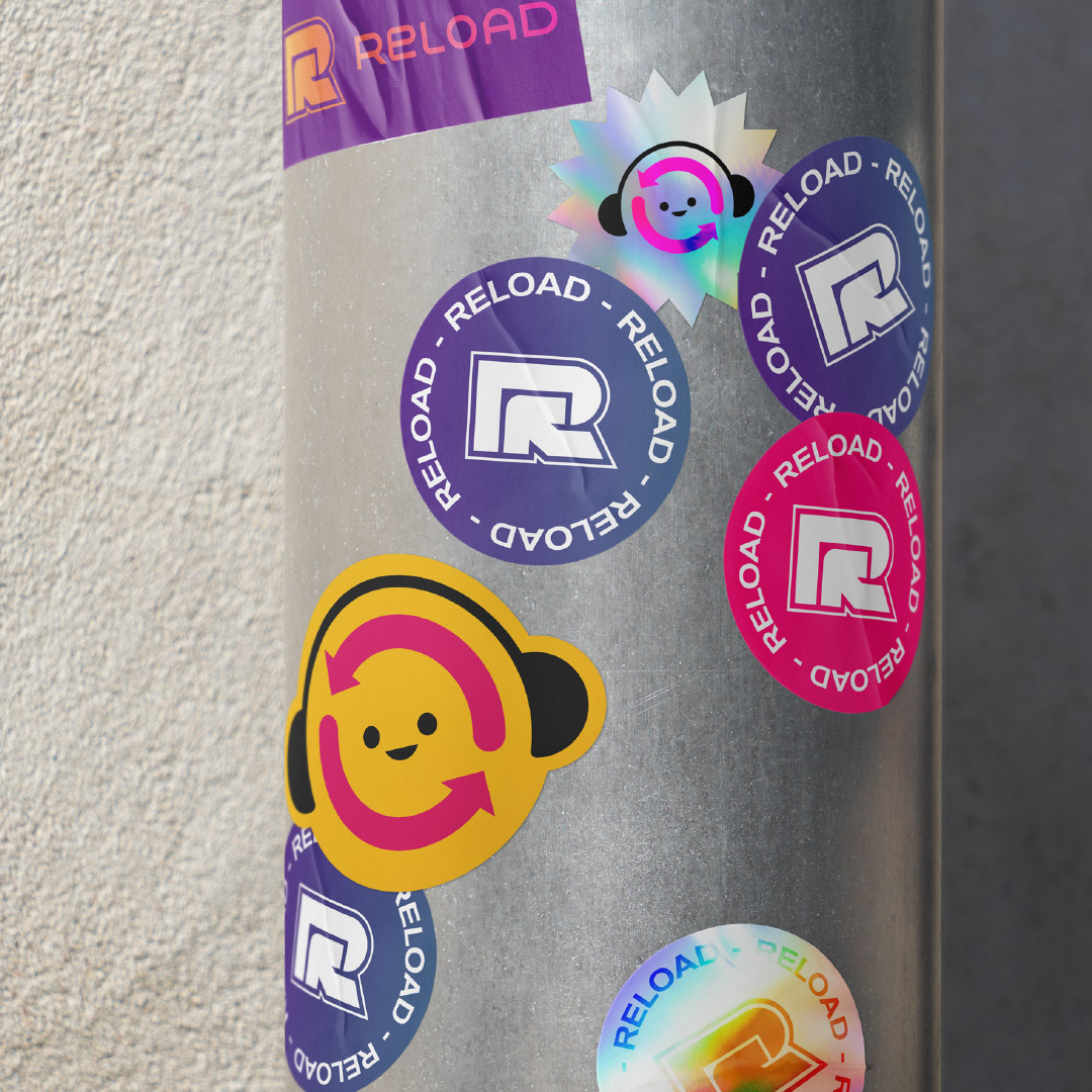
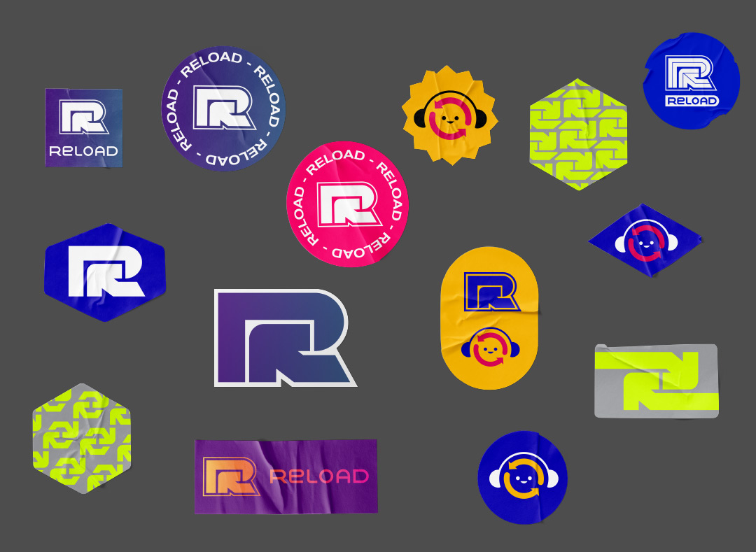
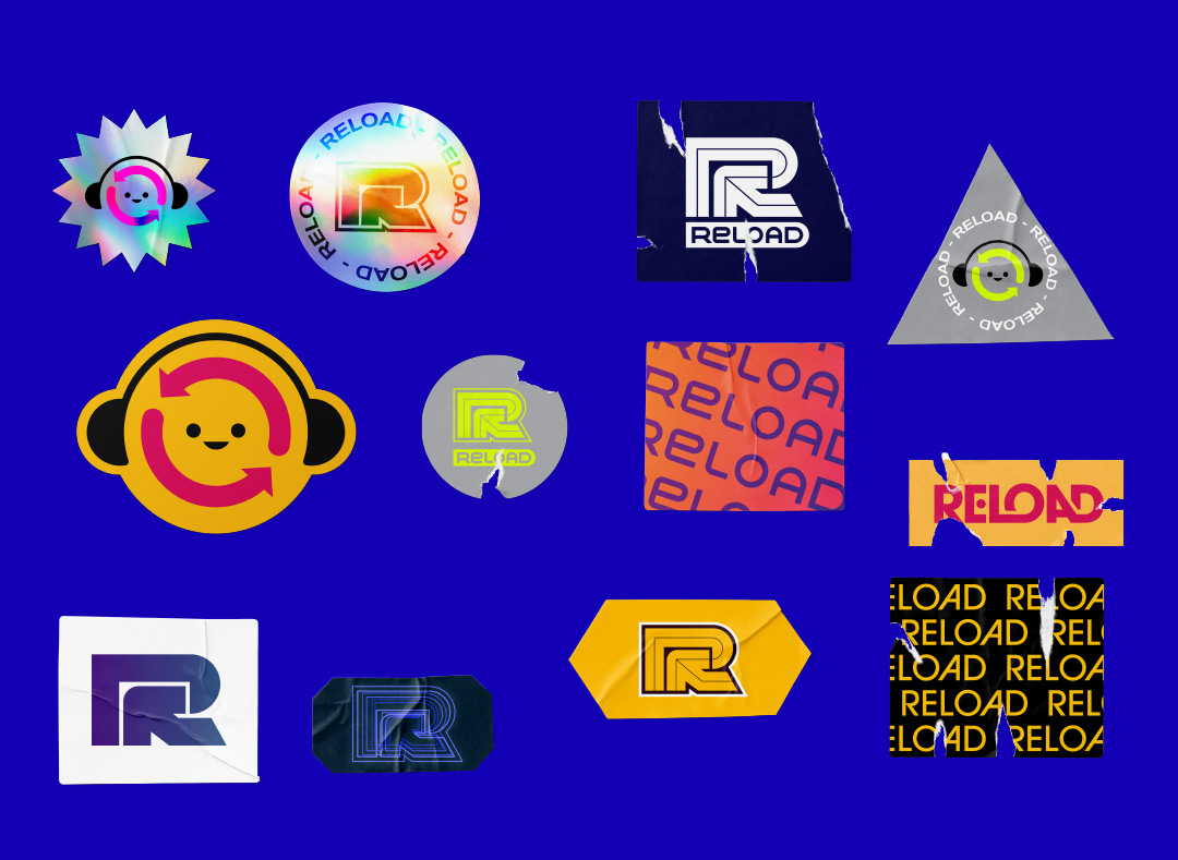
In the end we have the main R symbol with plenty of variants, that can be used in the form of stickers. It doesn't matter how many stickers you use, or in which playful way. The Reload identity is always there.
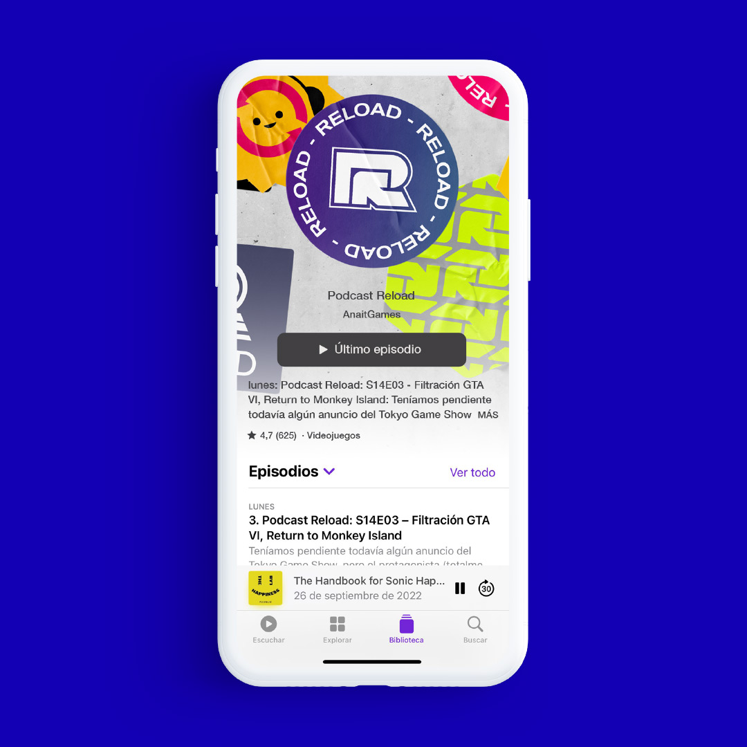
At some point during the process of creating the stickers a mascot appeared as a nod to the former logo (the "loading" symbol). It was very warm welcomed by the Anait Patreon community, and named as "Reloadín".
.